The US has 4% of the world's population but 21% of the global COVID-19-attributed infections and deaths. This column shows that when comparing excess mortality rates, a more robust way of reporting on pandemic deaths, Europe's cumulative excess mortality rate from March to July is 28% lower than the US rate, contradicting the Trump administration's claim that Europe's rate is 33% higher. The US Northeast – the region most comparable with individual European countries – has experienced substantially worse excess mortality than Europe's worst-affected countries. Had the US kept its excess mortality rate down to the level in Europe, around 57,800 American lives would have been saved.
The US has the highest COVID-19-attributed infections and deaths, accounting for 21% of global deaths. Defenders of the US's pandemic policy record assert that such figures are misleading since reported COVID-19 cases depend on the testing regime and many countries under-count COVID-19-related deaths.
Using excess mortality data is a more rigorous way to compare the pandemic's death toll. Excess mortality counts deaths from all causes relative to what would normally have been expected. This avoids miscounting deaths due to the under-reporting of COVID-19-related deaths and other health conditions left untreated, or potentially misattributing deaths to COVID-19 that had other causes. Measures taken by governments and individuals may influence death rates – for example, deaths from traffic accidents may decline but suicide rates may rise. Excess mortality captures the net outcome of all these factors. We show that the P-score – a measure of the rate of excess deaths (actual deaths minus ‘normal’ deaths) relative to normal deaths – is preferable to measuring excess deaths relative to population.
President Trump has claimed that ‘Europe (Note 1)’ has had a 33% higher rate of excess mortality than the US. It is unclear what measure of excess mortality and which comparison period he was using – he may have been considering excess deaths per capita. It is also unclear how he defined ‘Europe’ – possibly Italy or Spain were the countries he had in mind in his intended comparison with ‘Europe (Note 2)’. Our figures suggest the opposite: Europe had a 28% lower excess mortality rate than the US during March to July, using the most reasonable comparative measure. From end-February to 25 July, the US Centers for Disease Control and Prevention (CDC) calculates that excess deaths were about 207,000 above ‘normal’. If the US excess mortality rate had matched that of Europe, around 57,800 US citizens would have survived (Note 3).
Yet US policymakers had at least four advantages over their European counterparts in countries such as Italy and Spain that should have led to lower excess mortality rates than in Europe:
- First, there was more time to prepare. Genomic evidence suggests that Europe was the source of most infections that became evident in New York in early March. The US administration had three weeks' more warning given the lag between initial rises in excess mortality in Italy and Spain versus the US Northeast. For the South, West and Midwest (accounting for 83% of the US population), the delayed spread of the virus should have provided an even greater advantage.
- Second, the US has a younger population (Note 4) and COVID-19 mortality is significantly correlated with age.
- Third, the US has a lower population density than Europe as a whole and for large conurbations within, and viral spread is greater in more dense populations (Note 5).
- Fourth, the later onset should have enabled US authorities to take advantage of rapidly improving medical knowledge and capacity (the nature of the disease, treatment regimes, testing capacity, and the effectiveness of policies such as social distancing and masks).
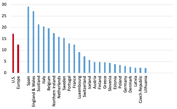
These multiple advantages should have reduced US excess mortality rates relative to Europe, but instead rates far exceed those of Europe and its countries (see Figure 1).
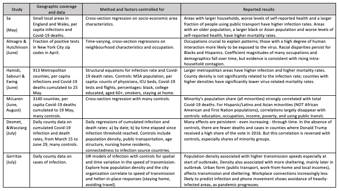
The more robust excess mortality P-score measure could help analyse cross- and within-country differences in order to draw lessons about the social and economic consequences of the pandemic and of relaxing lockdown restrictions. Studies on the spatial variation in COVID-19 infection and death rates to inform policymakers, many appearing via CEPR, are useful for framing the kinds of variables – urban density, spatial patterns, racial inequality – that are useful in cross-country comparisons. Table 1 summarises a representative subset (Note 6).
When is it valid to compare rates of excess mortality for the US and Europe?
In an application to European countries, we assessed the comparability of data on excess mortality between countries and regions (Aron et al. 2020a,b), reviewing the available data sources and comparing and contrasting different statistical measures of excess mortality (Note 7). We argued that P-scores at a weekly frequency or cumulated from the start of the pandemic were the most robust indicators for comparing excess mortality across countries. They are preferable to per capita rates of excess mortality, which are biased in favour of countries with younger populations. The P-score is defined as excess deaths as a percentage of ‘normal’ deaths. For weekly data, ‘normal’ deaths are often defined as the previous five-year average of the same weeks (Note 8). ‘Normal’ death rates reflect persistent factors such as the age composition of the population, the incidence of smoking and air pollution, the prevalence of obesity, poverty and inequality, and the normal quality of health service delivery. An advantage of the P-score is that it takes into account such differences in ‘normal’ deaths between countries or regions.
Even P-scores need to be interpreted with care. While P-scores are less affected than per capita excess deaths by differences in the age-composition of the population, they are not immune. The COVID-19 pandemic has disproportionately more severe outcomes for the elderly. Though less biased than the per capita rate, even the P-score measure of excess mortality computed for all ages will favour countries like the US with a younger population (Note 9).
Comparing plausible indicators of excess mortality for the US and Europe
We compare measures of excess mortality for the US (using CDC data) with Europe (using data from the Human Mortality Database, or HMD) (Note 10). European coverage consists of the 27 EU countries, excluding Ireland, Cyprus and Malta (with 5.0, 0.9 and 0.4 million people, respectively), but adds Iceland, Norway, Switzerland, and the UK nations. The total included population is 522.2 million, compared with 330 million for the US. For the US, CDC data, adjusted for trends, define normal weekly mortality. For European countries, normal weekly mortality is calculated as the average for that week in the previous five years (Note 11). The weekly count of excess deaths is then calculated as the actual deaths for that week minus the ‘normal’ number of deaths. For weeks where excess deaths are estimated to be negative, a count of zero is used instead. This avoids the problem of undercounting recent deaths, which could contribute to finding spuriously negative rates of excess mortality (Note 12).
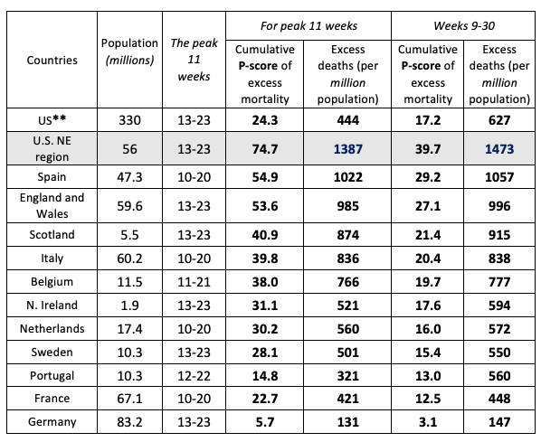
We compare cumulative excess mortality from the last week of February to the penultimate week of July (Note 13) and compute the two measures of rates of excess mortality: the per capita measure of excess deaths and the percent of ‘normal’ (i.e. the P-score measure). The July endpoint reflects missing data for some European countries for later weeks; also, recording lags in the US data (Note 14) make later observations less accurate. Table 2 shows the comparative results

Note: (i) See the text and Figure 1 for the countries included in the definition of Europe. (ii) Cumulative P-scores cover the weeks 9-30. Data are available for the US to week 36, but given reporting lags, are liable to undercount mortality in recent weeks because of lags in registration. (iii) Negative excess deaths were set to zero. (iv) See other notes under Table 3.
As noted, Europe has an older population and hence more ‘normal’ deaths per capita than the US (see Table 2, column 5). The ‘all ages’ P-score measure of excess mortality takes (significant) (Note 15) account of this and in Europe was 28% lower than in the US. Even on the cruder per capita figure, excess mortality in Europe was 21% lower than in the US. A cumulative P-score of 17.2% means that for every 100 ‘normal’ deaths, there were 17.2 additional deaths in those weeks in 2020.
Despite the multiple advantages of the US discussed above, which should have reduced relative excess mortality, the US rates far exceed those in Europe. Figure 1 shows P-scores, ordered from highest to lowest, for the US, Europe as a whole and various European countries. Spain and ‘England and Wales' (Note 16) have the highest excess mortality rates amongst European countries. Comparing a large, highly heterogeneous country like the US with individual European countries is inappropriate; also, the pandemic timing needs to be matched. A more relevant comparison is of the worst-affected US region with the worst-affected European countries during the pandemic's first wave.
Note: (i) Cumulative P-scores cover the weeks 9-30. Data are available for the U.S. to week 36, but given reporting lags, are liable to undercount mortality in recent weeks because of lags in registration. (ii) Negative excess deaths were set to zero. (iii) See other notes under Table 3.
Digging down: Comparing the US regions to large European countries
Arguably, the Northeast census region of the US (comprising nine states) (Note 17) provides a good comparator with the larger European countries in terms of population size, density, age composition, urban-rural structure and the timing of the pandemic. For the five worst-hit European countries, we compared weekly P-scores and the peak week cumulative P-scores in the first wave of the pandemic (Aron and Muellbauer 2020b). For an 11-week peak period, the starting dates varied by country between week 10 (ending 8 March) and week 13 (ending 29 March) of 2020. The equivalent 11 weeks for the US and the US Northeast are weeks 13 to 23 (Note 18). Table 3 compares cumulative P-scores for the US and the Northeast with the eight worst-affected European countries and with Germany, which registers the lowest P-score among large European countries. The US Northeast suffered by far the highest rate of excess deaths in the first wave of the pandemic. In a like-for-like peak week comparison, its P-score was 75%, compared to 55% for Spain and 5.7% for Germany. The US Northeast also had the highest per capita excess mortality in these weeks.
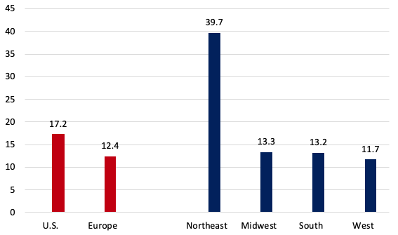
For the cumulative P-scores for weeks 9-30, the pattern is repeated. Figure 2 also shows Europe's cumulative P-score for weeks 9-30, which lies below three out of four US regions, and below the US as a whole.
Note: ** The US as whole is included for reference but cannot provide a like-for-like comparison with individual European countries over this time frame, since at least two of its four regions (the South and the West), comprising 62% of its population, experienced a far later spread of the pandemic and all four regions have not returned to zero excess mortality. The Northeast US region can be fairly compared over this time-frame with individual European countries. (i) Cumulative P-scores cover the 11 peak weeks shown in column 2. (ii) Negative excess deaths were set to zero. (iii) The European country ordering is by cumulative P-scores; the countries shown have the highest P-scores in Europe, apart from Germany, which has the lowest among the large economies. (iv) HMD only report for ‘England and Wales’, not separately for each; they report for Scotland and Northern Ireland. (v) HMD use deaths by week of occurrence for all the above countries, except the UK, where deaths by week of registration are used. (vi) For the US, the CDC define a week as ending on Saturday. For Europe, HMD define a week as ending on Sunday, except for ‘England and Wales’, which is Friday (see their metafile).
The weekly profiles of P-scores for the US Northeast and the US in Figure 3 suggest that deaths had almost returned to normal levels by week 23 in the Northeast, but not for the US as a whole, and illustrates the later arrival of the pandemic compared with Italy. The even later spread of the pandemic in the other US regions is seen in Figure 4, which also shows the share of these regions in total US excess deaths.
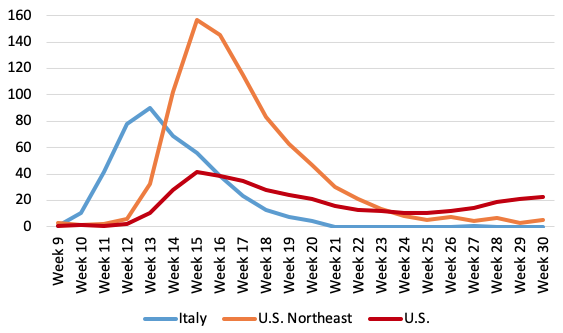
Note: (i) Data are available for the US to week 36, but given reporting lags, are liable to undercount mortality in recent weeks because of lags in registration. Data for Italy end in week 26 and were interpolated to week 30 using EuroMOMO z-score data (ii) Negative excess deaths were set to zero. (iii) The CDC define a week as ending on Saturday. HMD define a week as ending on Sunday, see their metafile. (iv) See other notes under Table 3.
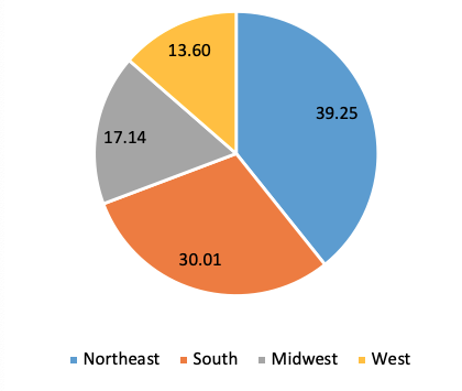
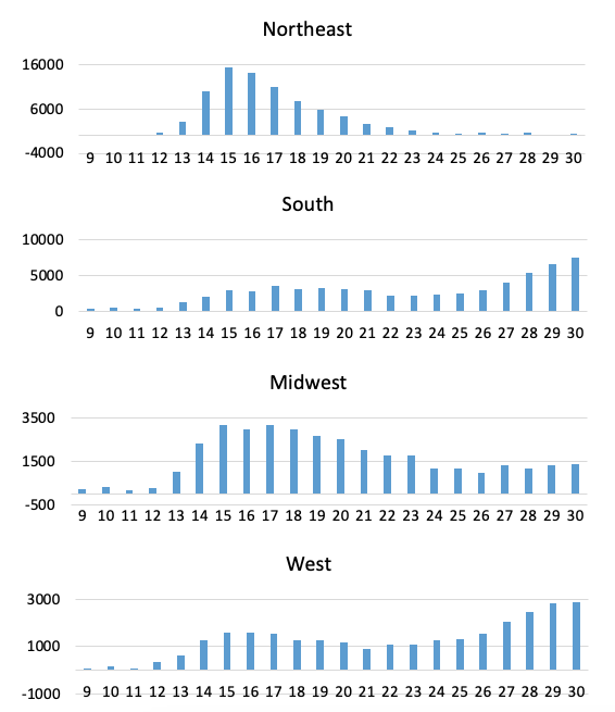
The bottom line: Is the claim that US excess mortality is lower than in Europe a fact or fiction?
We compared cumulated excess mortality for the US and Europe, measured by excess mortality per capita and the percentage of excess mortality relative to ‘normal’ deaths. Our definition of Europe has broad coverage. Excess mortality rates were significantly lower in Europe than in the US (from end-February to near-end of July 2020 (Table 3, Figure 1). US deaths exceeded ‘normal’ deaths by around 207,000. If the US excess mortality rate had matched that of Europe, around 57,800 US deaths would have been avoided. By the P-score, excess mortality in Europe was 28% lower than in the US; even on a cruder per capita figure, excess mortality in Europe was 21% lower than in the U.S. This is surprising as: (1) the pandemic arrived later in the US, giving policymakers more time to prepare; (2) the lower population density and degree of urbanisation and (3) lower median age in the US than in Europe should have resulted in lower mortality; and 4) the US could have taken better advantage of rapidly evolving medical knowledge and capacity. Our findings contradict repeated claims by President Trump that Europe had a 33% higher rate of excess mortality than the US (Note 19).
Examining the US Northeast census region, which is much more comparable than the rest of the US to European countries in terms of population, population density, age structure and degree of urbanisation, and in the timing of the first wave of the pandemic, leads to a similar conclusion. The first wave lagged Italy's first wave by three weeks. Comparing the 11 peak pandemic weeks for each, the Northeast had substantially higher rates of excess mortality than the most severely affected European countries (see Table 3). The Northeast region had 36% proportionately worse excess mortality than the worst-affected European country, Spain (i.e. a P-score of 75% versus 55% for Spain).
Most states and cities in the US Northeast have Democrat governors and mayors. Some might attribute higher excess mortality rates to this political factor. However, higher rates of excess mortality in Northeast states cannot be attributed to the governing party. A study of COVID-19 deaths and infection rates across US counties finds that counties with a high 2016 vote share for Trump have higher rates of COVID-19 mortality, accounting for population density, racial/ethnic composition and other controls (Desmet and Wacziarg 2020). This result appears to be confirmed at the state level when using excess mortality as the dependent variable: states with a higher share of the Democrat vote in the 2016 election have lower cumulative P-scores, given appropriate controls (Note 20). While the dense, urban Northeast had the highest excess deaths, the Midwestern and Southern states, many of which have Republican political leadership, also suffered higher excess mortality than Europe (Figure 4), despite being substantially less dense, more rural and having advance warning.
These results raise important questions as to why the US, with its technical and institutional capabilities and other advantages cited, was far less effective in its response to COVID-19 than Europe.
Spatial studies that explain these excess mortality patterns could lend policy insights.
Authors' note: We are grateful to Eric Beinhocker of INET for comments and to Jessica McDonald of FactCheck.org for highlighting the current relevance of the issue and working with us. Her article can be found here. We thank Our World in Data, especially Charlie Giattino, for providing data.
This article first appeared on www.VoxEU.org on September 29, 2020. Reproduced with permission.


